Introduction
The CSS box model is a way of representing the layout of HTML elements on a webpage. It consists of four properties: margin, border, padding, and content.
The content is the area within the box that contains your actual content, such as text or images. The padding is the distance between the content and the border. The border is the line around the padding and content.
The margin is the space that is outside the border between the box and any other elements on the page.

Here is an example of the box model in action:
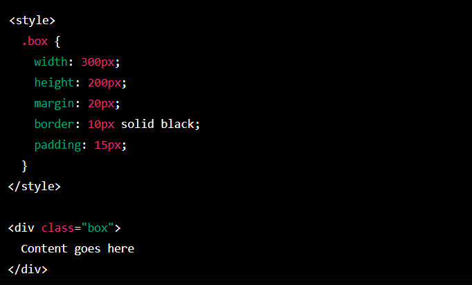
In this example, the box has a width of 300 pixels and a height of 200 pixels. It has a margin of 20 pixels on all sides, a 10 pixels thick and solid black border, and padding that is 15 pixels thick on all sides.
The box model is essential to understand because it allows you to control the layout and appearance of your HTML elements. By adjusting the values of the margin, border, and padding properties, you can create complex and visually appealing layouts on your webpage.
The box model
CSS Box Model: Height Width
In CSS (Cascading Style Sheets), the height and width properties are utilized to specify the height and width of an element’s box.
The height property selects the height of an element’s content area, while the width property sets the width of the content area.
The values of these properties can be specified in various units, including pixels (px), ems, percentages, and more.
For example, the following CSS sets the height of a div element to 100 pixels and the width to 200 pixels:
![]()
You can also use the box-sizing property to specify whether the height and width properties include the padding and border of an element or just the content area.
The default value is content-box, which means that the height and width properties apply only to the content area.
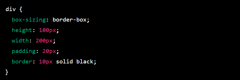
In this example, the box-sizing property is set to border-box, which means that the height and width properties include the padding and border of the element.
The total height and width of the element will be 130 pixels and 240 pixels, respectively, because the padding and border are included in the calculation.
CSS Box Model: Border Style
In CSS, the border property specifies an element’s border. You can use the border property to specify the style, width, and color of an element’s border.
Look at an example of how to use the border property:

This will create a solid black border with a width of 1 pixel around the div element.You can also specify the border separately for each side of the element using the border-top, border-right, border-bottom, and border-left properties. For example:
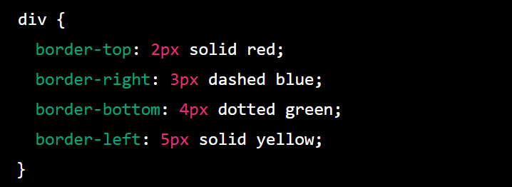
This will create a red solid border with a width of 2 pixels on the top of the div element, a blue dashed border with a width of 3 pixels on the right of the div element, a green dotted border with a width of 4 pixels on the bottom of the div element and a yellow solid border with a width of 5 pixels on the left of the div element.
You can also utilize the border-radius property to create rounded borders. For example:

This will create a solid black border with a width of 1 pixel around the div element and round the corners of the border with a radius of 10 pixels.
You can find more information about the border property and other related properties in the CSS specification.
CSS Box Model: Border Radius
Border radius is a CSS property that allows you to round the corners of an element’s border. You can specify different border radii for each corner of the element, or you can use the same value for all four corners to create a perfectly rounded element.
To use border-radius, you can add the border-radius property to your CSS rule, followed by a value in pixels, percentages, or any other valid length unit. For example:

This will create a border radius of 10 pixels for all four corners of the element with the class rounded element. You can also specify different border radii for each corner using the following syntax:Copy code

This will create a border radius of 10 pixels for the top-left corner, 20 pixels for the top-right corner, 30 pixels for the bottom-right corner, and 40 pixels for the bottom-left corner.
You can even use the border-radius property to create elliptical shapes by using different horizontal and vertical radii values. For example:

This will create a border radius that is 50% of the element’s width for the horizontal radius and 25% of the element’s height for the vertical radius, creating an elliptical shape.
Border radius can be a useful tool for creating visually appealing and modern designs, and all modern browsers support it.
CSS Box Model: Padding
The box model is a concept in CSS that describes the layout of an HTML element as a box with padding, borders, and margins.
The padding is the space within the element, between the element’s content and its border. You can specify the padding for an element using the padding property in CSS.
The padding can be specified for individual sides (top, right, bottom, left) using the padding-top, padding-right, padding-bottom, and padding-left properties, or it can be specified for all sides at once using the padding property.
Here is an example of how you might use the padding property in a CSS rule:

This would give the element a padding of 10 pixels on all sides. You can also specify different padding values for each side:
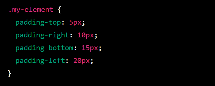
In this example, the element would have a top padding of 5 pixels, proper padding of 10 pixels, a bottom padding of 15 pixels, and a left padding of 20 pixels.
The padding is necessary because it can affect the size and layout of an element and its content.
For example, if you keep an element with a width of 100 pixels and a padding of 10 pixels on all sides, the element will take up 120 pixels of space on the page (100 pixels for the content plus 10 pixels of padding on the left and right sides).
CSS Box Model Margin
In Cascading Style Sheets (CSS), the box model is a design paradigm that defines the relationships between the elements of a webpage layout. It consists of four main components: the content, padding, border, and margin.
The margin is the outermost part of the box model. It is the space outside the border of an element, and it is used to create space between elements on a webpage. The margin can be defined using various CSS properties, such as margin-top, margin-bottom, margin-left, and margin-right.
These properties allow you to specify the size of the margin in pixels, percentages, or other units of measurement.
The margin can be used to create space between elements to improve the readability and aesthetics of a webpage. It can also be used to position elements relative to other elements on the page.
For example, you can use the margin property to position an element horizontally or vertically within a container or to align it with other elements on the page.
In addition to the standard margin properties, there are also shorthand properties such as margin and margin-bottom that allow you to set the margins for all four sides of an element at once.
For example, you could use the following code to set the top and bottom margins of an element to 10 pixels and the left and right margins to 20 pixels:
![]()
It is important to note that margins do not have a background color and do not take up space in the page’s layout. They are transparent and create space around an element.
CSS Box Model Auto
auto is a keyword in CSS that can be used in various contexts to specify that a value should be determined automatically by the browser.
Some examples of how auto can be used include:To set the width or height of an element to the size of its content, you can use width: auto or height: auto.
This can be useful when you want an element to expand or shrink to fit the size of its content rather than to specify a fixed width or height.
margin: auto can be used to center an element within its parent container horizontally. This is done by setting the left and right margins to auto and specifying a width for the element.overflow: auto can be used to create a scrollbar on an element if its content is too large to fit within its fixed dimensions.
This can be useful for creating scrollable areas on a page.position: auto can be used to reset an element’s position to the default position. By default, elements are positioned in the document’s normal flow and do not have a fixed position on the page.
There are many other uses for auto in CSS, depending on the context in which it is used. If you have any specific questions about how auto works in a particular context, please feel free to ask.Here are some examples of how auto can be used in CSS:To choose the width of an element to the size of its content, you can use width: auto. For example:

This will cause the element with the class container to expand or shrink to fit the size of its content.
To horizontally center an element within its parent container, you can use margin: auto and specify a width for the element. For example:

This will cause the element with the class container to be centered horizontally within its parent container as long as the parent container is at least 500 pixels wide.
You can use overflow: auto to create a scrollbar on an element if its content is too large to fit within its fixed dimensions. For example:

This will cause a scrollbar to appear on the element with the class scrollable if its content is larger than 500×500 pixels.
You can use position: auto to reset an element’s position to the default position. For example:

This will cause the element with the class reset to be positioned in the normal flow of the document rather than having a fixed position on the page.
CSS Box Model: Margin Collapse
In CSS, the margin property is utilized to set the amount of space around an element. When two elements are adjacent to each other, their margins can collapse into each other. This is known as margin collapse.
Here is an example of how margin collapse can occur:
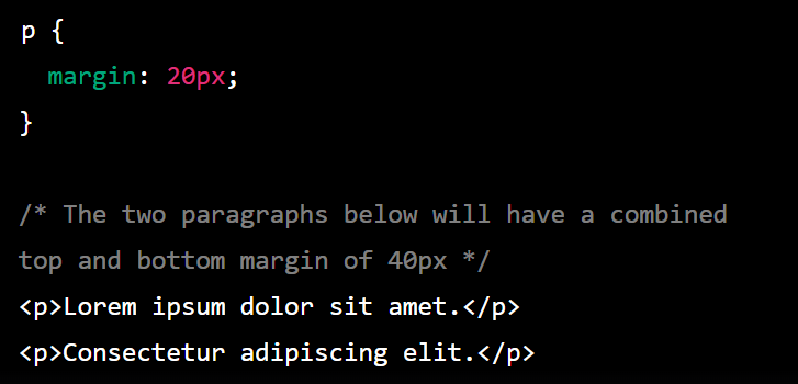
Margin collapse only occurs between adjacent vertical margins. If two elements have a horizontal margin (e.g., a left margin and a right margin), their margins will not collapse.There are a few ways to prevent margin collapse:
- Use a border or padding on the element to separate the margins.
- Use the overflow property with a value other than visible.
- Use the clear property to prevent the element from being next to an element with a margin.
It is essential to understand margin collapse because it can affect the layout of your webpage. By understanding how margin collapse works, you can use it to your advantage or avoid it when necessary.
For example, you could use a border to separate the margins like this:

Alternatively, you could use the overflow property like this:

Alternatively, you could use the clear property like this:

CSS Box Model: Minimum and Maximum Height and Width
In CSS, you can use the min-height and max-height properties to set an element’s minimum and maximum height, respectively. Similarly, you can use the min-width and max-width properties to set an element’s minimum and maximum width.
Here is an example of how you can use these properties:
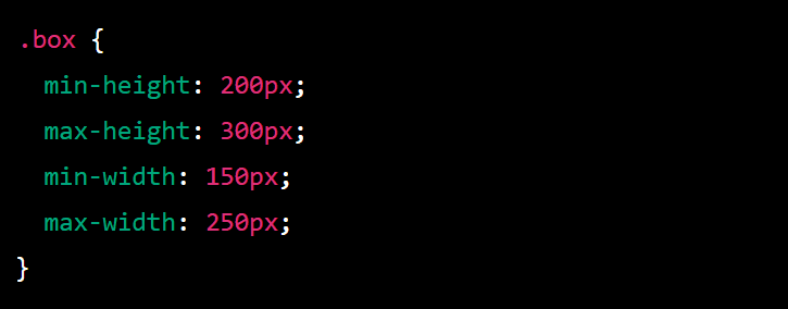
This will set the minimum height of the element to 200 pixels and the maximum height to 300 pixels. The element’s actual height will be somewhere between these two values, depending on the content within the element and any other layout constraints that may be in place.
The same applies to the minimum and maximum width of the element.You can also use the height and width properties to set an element’s fixed height and width, respectively. However, using min-height and max-height, or min-width and max-width, allows for more flexibility in the layout and can be helpful in responsive design.
It’s important to note that these properties apply only to block-level and replaced elements (such as images). Inline and inline-block elements do not have a height or width, and these properties will not affect them.
CSS Box Model: Overflow Property
In CSS, the overflow property controls how content too large for its container is displayed. When the content of an element is too large to fit within its dimensions, the overflow property specifies whether to clip the content, display scrollbars to allow the user to access the content, or display the content in some other way.
Here are some typical values for the overflow property:
- visible: The content is not clipped and may be rendered outside the element’s box. This is the default value.
- hidden: The content is clipped, and no scrollbars are shown. The content that is outside of the element’s box is not visible.
- scroll: The content is clipped, and scrollbars are shown, allowing the user to scroll through the content.
- auto: Similar to scroll, scrollbars are shown only if the content is too large to fit within the element’s dimensions.
Here’s an example of using the overflow property:
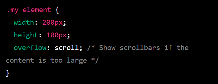
In this example, the .my-element element has a fixed width and height of 200 pixels and 100 pixels, respectively. If the content inside this element is too large to fit within these dimensions, scrollbars will be shown to allow the user to access the content.
You can also use the overflow-x and overflow-y properties to control the overflow behavior in the horizontal and vertical directions.For example:
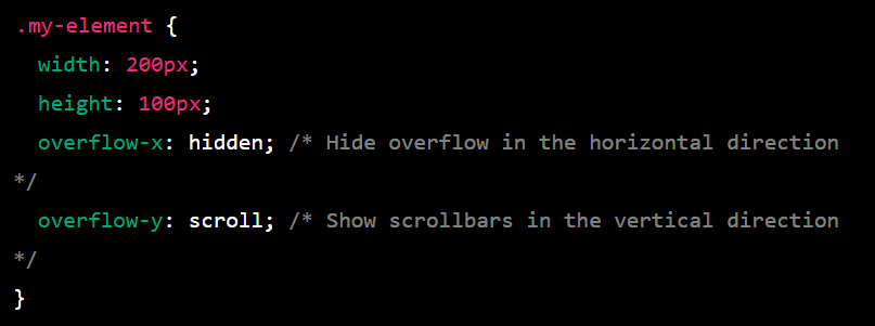
In this case, the content will be hidden if it overflows in the horizontal direction, but scrollbars will be shown if it overflows in the vertical direction.
CSS Box Model: Resetting Defaults
A CSS reset is a set of styles that are used to normalize the default styles of different browsers. The goal of a reset is to ensure that all browsers display a consistent set of default styles so that web developers can build on top of those styles without worrying about inconsistencies between browsers.
There are a few different ways to reset the default styles, but one common method is to use a CSS reset stylesheet. This is a stylesheet that contains a set of styles that overwrite the default styles of different elements, such as margins, padding, font sizes, and so on.
To use a CSS reset stylesheet, you can include it in the head of your HTML document by linking to it with a link element:

Alternatively, you can copy the reset styles into your own stylesheet and include that stylesheet in your HTML document.
Here is an example of a simple CSS reset stylesheet:
/* Reset styles */html, body, div, span, applet, object, iframe,h1, h2, h3, h4, h5, h6, p, blockquote, pre,a, abbr, acronym, address, big, cite, code,del, dfn, em, img, ins, kbd, q, s, samp,small, strike, strong, sub, sup, tt, var,b, u, i, center,dl, dt, dd, ol, ul, li,fieldset, form, label, legend,table, caption, body, tfoot, thead, tr, th, td,article, aside, canvas, details, embed, figure, figcaption, footer, header, hgroup, menu, nav, output, ruby, section, summary,time, mark, audio, video {margin: 0;padding: 0;border: 0;font-size: 100%;font: inherit;vertical-align: baseline;}/* Make sure the image is responsive */img {max-width: 100%;height: auto;}/* Make sure all lists are styled consistently */ul, ol {list-style: none;}/* Remove default styling for table elements */table {border-collapse: collapse;border-spacing: 0;}/* Remove default styling for blockquote */blockquote, q {quotes: none;}blockquote:before, blockquote:after,q:before, q:after {content: ”;content: none;}/* Make sure all links are styled consistently */a {text-decoration: none;color: inherit;}/* Remove default styling for form elements */button, input, select, textarea {margin: 0;font: inherit;color: inherit;}/* Remove default styling for horizontal rule */hr {display: block;height: 1px;border: 0;border-top: 1px solid #ccc;margin: 1em 0;padding: 0;}
A CSS reset should generally be used.
CSS Box Model: Visibility
In CSS, the visibility property determines whether or not an element is visible on the page. If an element has a visibility value of hidden, it will not be visible to the user, but it will still take up space in the layout.
If an element has a visibility value of collapse, it will not be visible to the user and will not take up any space in the layout.Here is an example of how you can use the visibility property in your CSS:
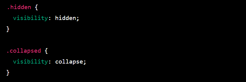
You can then apply these classes to your HTML elements like this:Copy code

It’s important to note that the visibility property only affects the visibility of an element and not whether or not the browser renders it. To prevent an element from being rendered by the browser, you can use the display property with a value of none.
CSS Box model Summary
The CSS box model represents the layout of an HTML element on a web page. It consists of four parts:
- Margin: The margin is the space around the element, outside of the border. It is transparent and does not have any background color.
- Border: A line surrounds the element and separates it from other elements on the page. It can have a color, style, and width.
- Padding: The padding is the space between the border and the element’s content. It is transparent and does not have any background color.
- Content: The content is the actual content of the element, such as text or an image.
By default, the width and height of an element are determined by the content of the element. However, you can use CSS to specify the width and height of the element, as well as the margin, border, and padding. This can be useful for creating consistent layouts and spacing between elements on a page.
You can also use the CSS box model to specify the position of an element on the page using the position, top, right, bottom, and left properties. This can be useful for creating complex layouts and positioning elements relative to each other.
